Unlike so many other tools and skills in a photographers bag, the histogram is not very well known or understood. Yet the histogram is a very powerful and useful tool, but its technical nature keeps it in the shadows. A histogram is simply a chart that shows the relative number of pixels of the various shades in a photo. Shades range from totally black to totally white. This chart is available in most cameras and a staple in post-processing tools. You can use it while taking pictures as well as when you enhance and polish up the photos to bring out the best in them.
The histogram in the camera

Modern cameras have very sophisticated light metering to provide correct exposure for each scene, but they cannot read the photographers mind. Sometimes the camera misses and the exposure is not optimum.
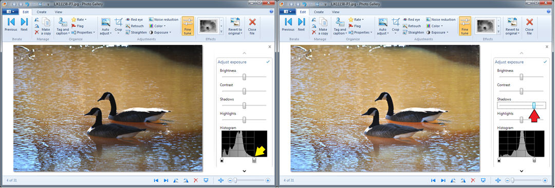
Often the histogram can show the situation and allow the photographer to make an exposure adjustment to capture the scene more effectively. The illustration here shows the histogram for a photo of a couple of Canada geese on a pond. Notice that the data on the right side ends just after the three-quarter mark (blue arrow). No data on the top end generally, but not always, means that the photo is underexposed. Increasing the exposure by one stop would capture more data, more shades, and make a more pleasing picture.
We live in a world with a huge variation of light, from dark nights and inside structures with little light to bright full sunlit beaches or snowy hillsides. Our eyes and brains have learned to cope with that. Those magnificent cameras, on the other hand, are much more limited. The sensors tend to have a range from the darkest, just discernible data bit to full scale of about 1 to 10,000 (give or take). That is a 12 to 14 bit range. A few cameras can do a bit better. So camera lenses have adjustable apertures, the f-number, and shutters can expose for variable lengths of time to fit the amount of light falling on the sensor to its range. There is also a “volume” control, called the ISO setting, that adjusts the sensitivity of the sensor. It is these settings that the cameras can manage to do so well for most photos.
Cameras make assumptions about the scene even when you have dialed in some setting, like “back-lit scene”, to assist the operation. The exposure system assumes that it is dealing with an “average” scene, possible modified by some settings and some intelligence derived from the multiple sensors and built-in lookup charts. The classic “average” scene is the proverbial “18 percent gray card”. This has been the standard for setting exposure meters for many decades and has proven reasonably effective. If you take a picture of a uniform card – it doesn’t have to be “18 percent gray” – the histogram will show a single compact bar near the center of the histogram, even if it was a white piece of paper, provided the camera was allowed to set the exposure. It just assumed that it was “average” with more light on it. That is why a white dog romping in snow comes out as a dingy underexposed picture.
So underexposure is easily recognized by a lack of data on the right end, and maybe the major peak being on the left side of middle.
Overexposure tends to burn out the brightest parts of the picture. If there is more light on the camera sensor than it can measure in its range, it will record that spot as all white. The histogram will show the data “piled up” against the right side. If you see data against the right edge be suspicious. It may not always be a problem. For example in taking photos of the geese on the pond there were many angles that showed sun glint on the water. Those are direct reflections of the sun, they will always be way brighter than anything in the scene. Such small specs will be completely white.
What about the left end of the histogram? That is the data for the darkest pixels. Most scenes have some very dark parts and thus the data goes all the way to the left end. Here again the data might be “piling up” if there are very deep shadows that simply don’t have enough light to contribute much. If the data goes across the entire histogram you just might have a scene with a wider range of light than the camera sensor can handle. That gets us to the technical part of this article. I will not bring in much science and very little math, but will try to explain and review some of the technical aspects.
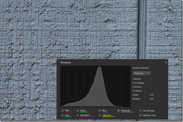
Photos of 18 percent gray cards are rather unexciting and bland, so here are two photos to illustrate how the camera interprets what it is sees. The first one is of the side of a gray-painted barn. Not very exciting either, but there is some texture there so it is not just a uniform gray. The exact color of each pixel varies over a wider range. The crevices are shadowed an thus look darker. The histogram shown here is not from the camera but that would look pretty much the same. Note that the data peaks close to the middle.
I also said that the camera couldn’t tell a white card from a gray one and would adjust the exposure as it it were an average “18-percent gray” scene. Rather than taking a picture of a white sheet of paper I set up a rather white scene: A white egg on a white fabric with soft light so the shadows would not be very dark. Here then my “18-percent gray egg”.
Take a look at the histogram as shown by different post-processing editors, to the right of the photo.


So far I have talked about the histogram in very general terms and not given any specific details on using the histogram. There is a reason for that. Let’s go back to that 18-percent gray egg and the barn. If it is 18 percent why is the data in the middle, isn’t that 50 percent?
A little detour
Here we need to take a little detour and look at the “output” end – you are seeing this on a monitor. Most photos are seen on monitors or screens of phones, tablets, and such. When picture data is sent to a monitor the pixel brightness on the monitor does not correspond linearly to the pixel data values. For example a patch of pixels with a data value of 200 is not twice as bright as a patch with pixel values of 100. The brighter patch is actually about 4.6 times as bright. Huh? The brightness, or rather the data is expanded “exponentially”. The mathematical relationship is a power function, the conventional exponent, called gamma, is 2.2. Let’s not go into the details or the reasons, just accept that this is how it is done. If you are in the monitor business, you pretty much have to follow this convention if photos are supposed to look realistic and match what you see on other products. Similarly if you are in the picture file business you better compress your data in the equivalent manner if it is to look good on monitors. You can get a lot of information and misinformation on this if you search for “gamma correction”.
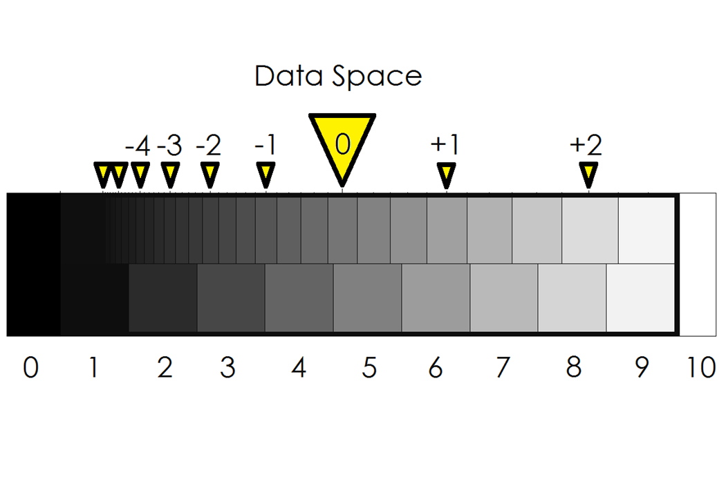
The data values shown in the histogram do not relate directly to the brightness values of the scene that was photographed. The values correspond to the compressed data. Even the histogram on the camera shows this compressed data, as does a histogram displaying “raw” camera data. With this compression the 18-percent gray value comes out just below the center of the range.
In the chart below the 18-percent, “normal”, exposure is indicated by the large triangle with “0” in it. The values to the right and left show where the data would end up if the camera data were compressed in exact complement to the monitor expansion. You can see what one or two stops overexposure would get, and similarly one to several stops underexposure. Actual photo data produced by your camera or processing tools does not follow this exactly, there are several different conventions for “color space” that include variations from this relationship particularly at the bottom and top ends.
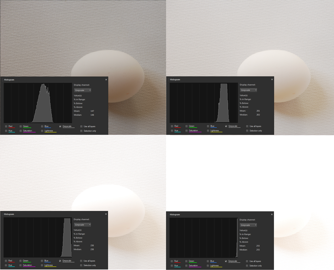
If you are still with me, you will now realize that the histogram can be a very useful tool but it is a bit hard to relate to camera exposure. Looking at the chart above you might conclude that there is a bit more than two stops “head” space on the white side. If you over-expose the proverbial gray card by more than about two and a half stops the image will be hopelessly full white. Is that so? It is close. Take a look at four photos of my “18-percent gray egg” – one, two, three and four stops over the normal exposure:
These photos were taken at f/11 with shutter speeds of 1/8, 1/4, 1/2, and 1 sec respectively. As you can see, the three- stops-over (lower left) image fits into the histogram, but just barely. The picture is much too light, even for a white egg on a white fabric. The four-stops-over image is hopelessly overexposed with most of the data off-scale and rendered as a value of 255 – totally white.
How should you expose a white object? If the camera is allowed to make its judgment it will make the object 18-percent gray. A white sheet of paper has a reflectivity of 90 to 95 percent. So the exposure should be 5 times as much (90/18=5), maybe a tad more, that is 2 and 1/2 stops. If the camera said the exposure time should be 1/15 sec then you should select a shutter speed of 1/3 sec. If the histogram is more spread out, you want an exposure that does not cause parts to go “off-scale” and become totally white.
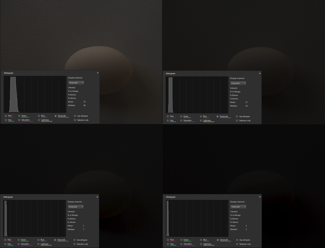
How about the other direction? What does underexposure do? Let’s take a look at the exposures going the other direction.
With my camera the exposures “dive” much more rapidly than would be expected from the data space chart above. These exposures are at f/11 and 1/30, 1/60, 1/125, and 1/250 sec respectively. Hopeless after just a couple of stops. As you can see, the photos are totally underexposed but the histogram still shows data above full black, not by much, mind you, but there is still something there. We will come back to that later.
The histogram in post-processing
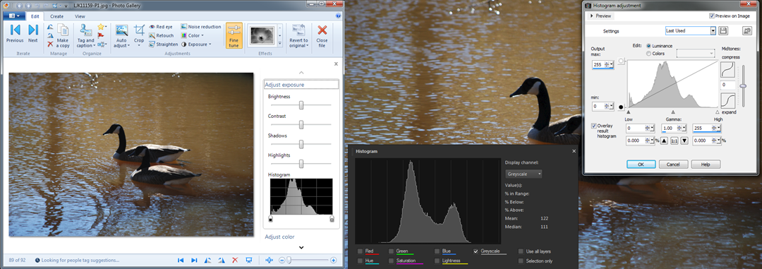
Here I call “post-processing” anything that is done to the picture data once it is transferred to the computer. Many cameras provide tools for doing processing on the photo while still in the camera. It is pretty hard to do much with the small screen in back of the camera, so I don’t use these features. Let’s start with that photo of the geese that we saw at the top of this article. Here is the photo as seen in Photo Gallery and in PaintShop Pro, using two different tools.
Note that the Photo Gallery histogram is quite identical to what was seen in the camera. I am using the Nikon codec in my computer, so this is not surprising. The two histograms in PaintShop Pro differ quite a bit as they use different tools. Don’t let that bother you, some people see the world through rose-colored glasses and others don’t. Different tools use different approaches. Still, the main features of the histograms are pretty much the same.
Notice the little symbols below the histogram in the Photo Gallery view and in the light window in PSP. In PSP they are labeled “Low” and “High”. These really are controls, sliders, if you will, and they are your most powerful tools for using the histogram in post-processing. These controls let you “spread” the histogram. They define the lowest data value that should be recomputed to black, and the highest data value that should be recomputed to white. The rest of the data is spread proportionately between these values.
Setting the histogram so that there is some data at or near black, and some data just below white will expand the range of tones of the photo. Let’s see what that does for our geese.

Some tools let you manipulate the histogram in many more ways. Take a closer look at the tool in PaintShop Pro. Other tools like Photoshop have similar tools. There are controls for adjusting the “gamma”, yes, that is what we talked about above, and compressing or expanding the mid tones. With the “Curves” tool (not shown) you can take that diagonal line at any point and distort the way the data is manipulated.
Specialized Tools
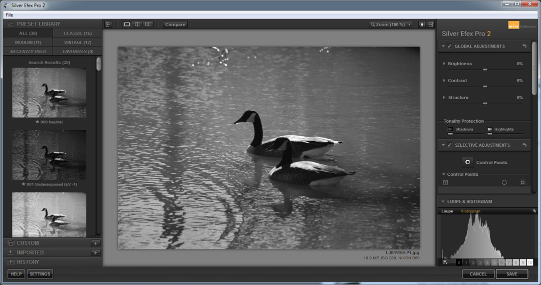
There are also specialized post-processing tools available with many of the histogram adjustments preset to achieve a number of different effects. For photographers specializing in black and white photography the “goto” tool is NIK Silver Efex. Here are a couple of examples from that tool using this same photo.
On the left the “High key” effect was selected, on the right the “Low Key” effect. Note the histograms and how the data was “shoved” toward the high and low ends of the histogram. There is much more these tools can do, but that is beyond the scope of this article.
The zone system
In a couple of the illustrations above there were some embedded “teasers”. The data space chart shows patches labeled from 0 to 10. The histograms with the egg photos show nine divisions. Here another view from Silver Efex that shows a zone scale underneath the histogram:
The zone system divides the histogram into 9 “zones” – plus zone 0 – all black, data value 0 - and zone 10 - all white, data value 255. We will leave the details to another article.
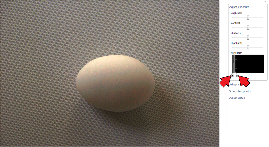
For now just one more demonstration as another teaser: Take the two stop underexposed egg photo and spread the histogram out completely and here is what you get:
The black slider was moved up a little to meet the data and the white slider was moved down to the top of the data. The earlier image of this photo showed the egg as recognizable but otherwise totally dark. Is it not impressive how much useable picture information there was “hiding in the shadows”? There is much to be recovered from the dark shadows in your photos too!
As a nod of thanks to my unpaid “talent” that so dutifully served in the illustrations for this article here some “studio publicity” shots.
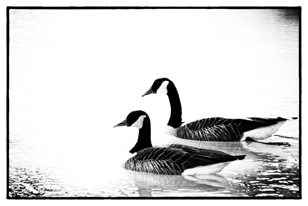
For the geese a NIK Silver Effex creation using the Film Noir 2 effect, this spreads the data so most of it is pushed up against the black or white ends with very little left in the middle. The effect is almost complete black or white.
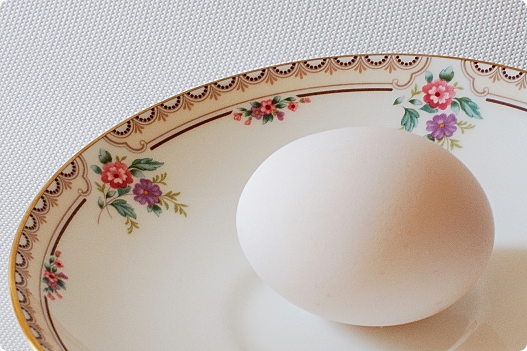
And for my patient egg a “dolled up” color shot in a more pleasant setting.
.:.

