This is a test post.
Thursday, December 22, 2022
Saturday, April 5, 2014
Museum Photography
Museum Photography
Museums present a treasure trove of fascinating artifacts that can make appealing photographs. Museum photography offers a whole set of challenges that you need to tackle to bring home beguiling images of those tokens of days past. Here are my thoughts that might help you to make a museum visit a fun and productive experience.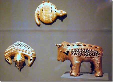
The first obstacles to museum photography are the rules imposed by the institution. Some museum strictly prohibit any photography, on the other end of the scale are places that urge you to bring your camera. Most are somewhere in between.
The larger museums may have extensive information about taking pictures on their website. They also tend to be the most restrictive. If you don’t find specific information on photography give the museum a call and ask.
The most likely rules let you take photographs for your own use – no publication, commercialization or selling of the photos. You can often get permission for such use, but generally that involves fees, special scheduling, supervision, and approval of the final images. That is beyond the scope of this article.
Some museums restrict the type of cameras that can be used. Cellphone cameras and unobtrusive point-and-shoot cameras are more likely to be allowed. Anything that looks like professional gear may be frowned upon.
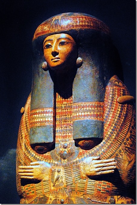 For security reasons museums, like so many other places, tend to prohibit backpacks and large cases. Plan on travelling light, just the camera and maybe an extra lens – not much more.
Expect that tripods are not allowed, they do impede traffic and the enjoyment of the exhibits by other visitors. Flash or other artificial light may generally not be used. Many artifacts have delicate paints and pigments that are affected by light and the use of bright lights will degrade these items, obviously something you don’t want to do.
Having maneuvered around access restrictions you are now faced with another set of obstacles.
Museums tend to be dark places. That means using large apertures, slow shutter speeds that you can successfully handhold, and high ISO, sensor sensitivity, settings. Not the best formula for crisp, sharp images. Be prepared to spend a good deal of time on post-processing.
Learn to handhold your camera for steady pictures. Lens vibration reduction features can help a great deal. Bracing your elbows against your body and holding your breath during the exposure can allow shutter speeds below 1/10 of a second.

Especially smaller artifacts will likely be in glass cases. Museums generally try to keep these quite clean, but reflections can be a pain. The closer you come to the glass the easier it is to avoid reflections from room lights, yourself, your camera and things behind you. Do not touch your camera to the glass, that might interfere with your lens focusing and may introduce vibrations. Do not brace yourself with a hand against the glass, your fingerprints can only detract from the experience of the visitors behind you.
For larger objects you have the added problem of disturbing other items or even visitors on the other side. The shallow depth of field at large aperture settings helps a great deal. You should also consider getting down on a knee to get an upward angle. The higher walls and ceilings may make for a more pleasing background. Of course, a downward angle might also be possible, but do not even think of climbing on displays or furniture.
Post-Processing
So you did the best you could and have a haul of exposures to process into your masterpieces.
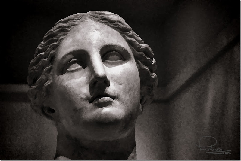
Here is an example that I took all the way to “café art”. This photo is of a head of the Greek goddess Demeter at the Michael C. Carlos Museum, Emory University, Atlanta, Georgia. It was hand-held at 1/6 sec. The other parameters are f/5.6, 55mm, ISO 1600. There was just a tiny bit of camera shake visible at high magnification.
My camera is not of the latest technology and high ISO settings show a great deal of noise. Your camera may do a lot better. On a visit to the above-mentioned Carlos museum I used mostly ISO 3200 – the highest setting – to allow shutter speeds of around 1/15 second. To reduce the noise in the photos I used the “edge-preserving smooth” tool in PaintShop Pro. Here is an illustration of the tool’s effect:
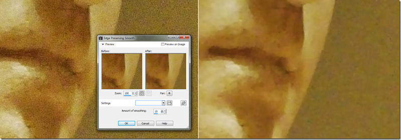
The screenshot on the left shows the original, the one on the right the resulting smoothing. For this illustration I used a higher setting than I actually used in order for the effect to be more obvious in this blog post. A high smoothing setting results in a “painterly” look as you can see. It does, however, reduce the apparent noise enough so that further processing steps can bring out the best in the photo. For the illustrations above and the one below, all from the Carlos Museum, I mostly maintained the warm look of incandescent illumination since that is what the museum uses. Here is the head of the Aphrodite statue, one of the museum’s prize properties.
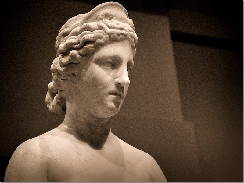
Here the lighting in the museum and the background work well.
For some photos, where the lighting was too contrasty because of localized spotlights, I found using HDR effect tools useful for flattening the tones. My favorite one is the HDR effect in onOne Perfect Effects 8. A similar tool , but a bit harder to use, is also found in Picasa.
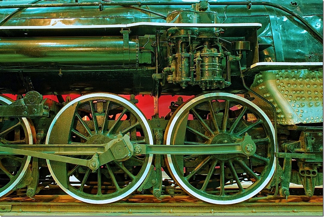
I used the HDR effect tool on the photo below to bring out the detail of the machinery. This photo is from the Southeastern Railway Museum, Duluth, Georgia. This museum is a delight for photographers – your cameras and even tripods are welcome. The photo below was a 20 second exposure taken inside one of their large buildings. Clearly not in reach of a handheld camera.
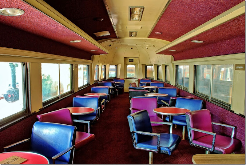
Even the interiors of outdoor displays require long exposures. The above photo was a 3.6 second exposure.
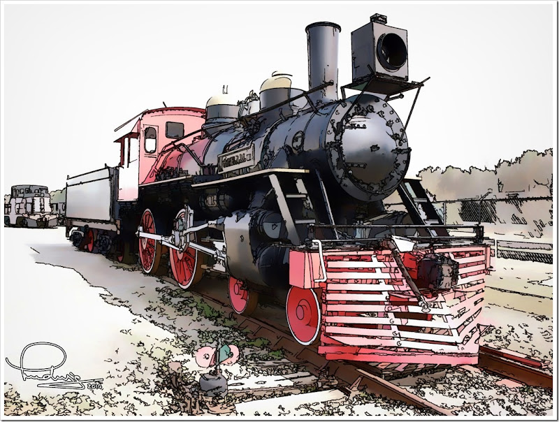
For another outdoor photo the problem was a a gray, overcast sky. My solution for this was to make the photo into a line and ink “painting”.
There is much to see at museums, and many photo opportunities. Enjoy!
....
Michael C. Carlos Museum, Emory University
Southeastern Railway Museum, Duluth, GA
A day at the Southeastern Railway Museum with the SPS
This article was first published in Café Ludwig
.:.
© 2014 Ludwig Keck
Monday, March 3, 2014
Use the histogram to improve your photos
Unlike so many other tools and skills in a photographers bag, the histogram is not very well known or understood. Yet the histogram is a very powerful and useful tool, but its technical nature keeps it in the shadows. A histogram is simply a chart that shows the relative number of pixels of the various shades in a photo. Shades range from totally black to totally white. This chart is available in most cameras and a staple in post-processing tools. You can use it while taking pictures as well as when you enhance and polish up the photos to bring out the best in them.
The histogram in the camera
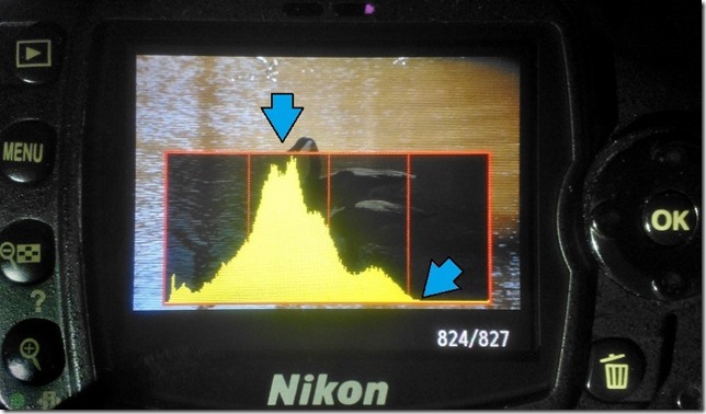 After you take a photo your camera most likely can provide the histogram for the shot. Most cameras provide just a combined histogram rather than data for each color, but that is quite sufficient to assist in getting the best exposure.
Modern cameras have very sophisticated light metering to provide correct exposure for each scene, but they cannot read the photographers mind. Sometimes the camera misses and the exposure is not optimum.
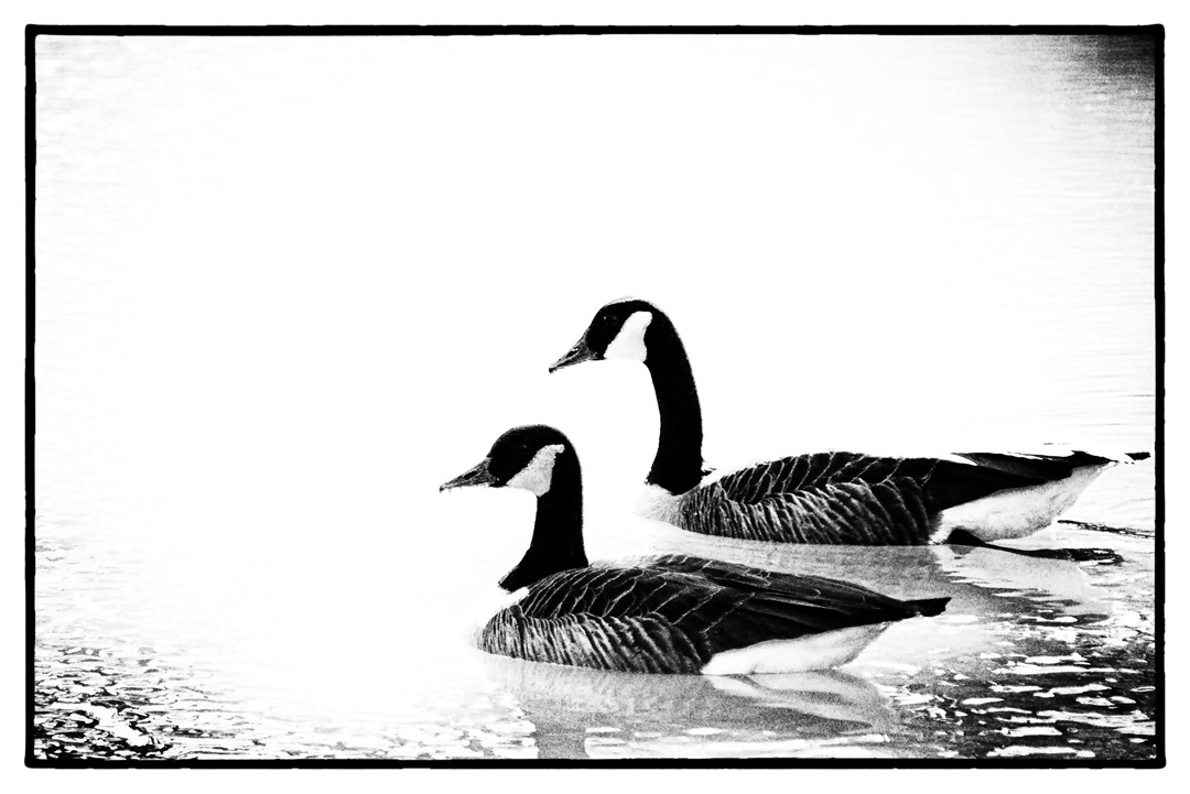
Often the histogram can show the situation and allow the photographer to make an exposure adjustment to capture the scene more effectively. The illustration here shows the histogram for a photo of a couple of Canada geese on a pond. Notice that the data on the right side ends just after the three-quarter mark (blue arrow). No data on the top end generally, but not always, means that the photo is underexposed. Increasing the exposure by one stop would capture more data, more shades, and make a more pleasing picture.
We live in a world with a huge variation of light, from dark nights and inside structures with little light to bright full sunlit beaches or snowy hillsides. Our eyes and brains have learned to cope with that. Those magnificent cameras, on the other hand, are much more limited. The sensors tend to have a range from the darkest, just discernible data bit to full scale of about 1 to 10,000 (give or take). That is a 12 to 14 bit range. A few cameras can do a bit better. So camera lenses have adjustable apertures, the f-number, and shutters can expose for variable lengths of time to fit the amount of light falling on the sensor to its range. There is also a “volume” control, called the ISO setting, that adjusts the sensitivity of the sensor. It is these settings that the cameras can manage to do so well for most photos.
Cameras make assumptions about the scene even when you have dialed in some setting, like “back-lit scene”, to assist the operation. The exposure system assumes that it is dealing with an “average” scene, possible modified by some settings and some intelligence derived from the multiple sensors and built-in lookup charts. The classic “average” scene is the proverbial “18 percent gray card”. This has been the standard for setting exposure meters for many decades and has proven reasonably effective. If you take a picture of a uniform card – it doesn’t have to be “18 percent gray” – the histogram will show a single compact bar near the center of the histogram, even if it was a white piece of paper, provided the camera was allowed to set the exposure. It just assumed that it was “average” with more light on it. That is why a white dog romping in snow comes out as a dingy underexposed picture.
So underexposure is easily recognized by a lack of data on the right end, and maybe the major peak being on the left side of middle.
Overexposure tends to burn out the brightest parts of the picture. If there is more light on the camera sensor than it can measure in its range, it will record that spot as all white. The histogram will show the data “piled up” against the right side. If you see data against the right edge be suspicious. It may not always be a problem. For example in taking photos of the geese on the pond there were many angles that showed sun glint on the water. Those are direct reflections of the sun, they will always be way brighter than anything in the scene. Such small specs will be completely white.
What about the left end of the histogram? That is the data for the darkest pixels. Most scenes have some very dark parts and thus the data goes all the way to the left end. Here again the data might be “piling up” if there are very deep shadows that simply don’t have enough light to contribute much. If the data goes across the entire histogram you just might have a scene with a wider range of light than the camera sensor can handle. That gets us to the technical part of this article. I will not bring in much science and very little math, but will try to explain and review some of the technical aspects.
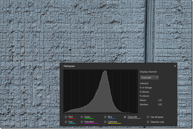
Photos of 18 percent gray cards are rather unexciting and bland, so here are two photos to illustrate how the camera interprets what it is sees. The first one is of the side of a gray-painted barn. Not very exciting either, but there is some texture there so it is not just a uniform gray. The exact color of each pixel varies over a wider range. The crevices are shadowed an thus look darker. The histogram shown here is not from the camera but that would look pretty much the same. Note that the data peaks close to the middle.
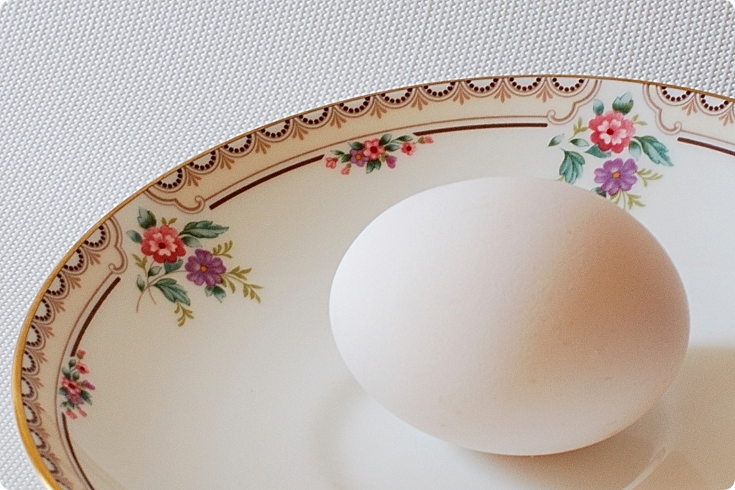
I also said that the camera couldn’t tell a white card from a gray one and would adjust the exposure as it it were an average “18-percent gray” scene. Rather than taking a picture of a white sheet of paper I set up a rather white scene: A white egg on a white fabric with soft light so the shadows would not be very dark. Here then my “18-percent gray egg”.
Take a look at the histogram as shown by different post-processing editors, to the right of the photo.
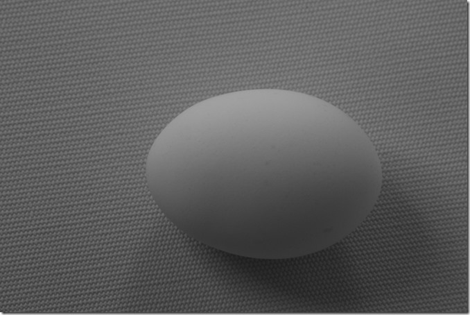
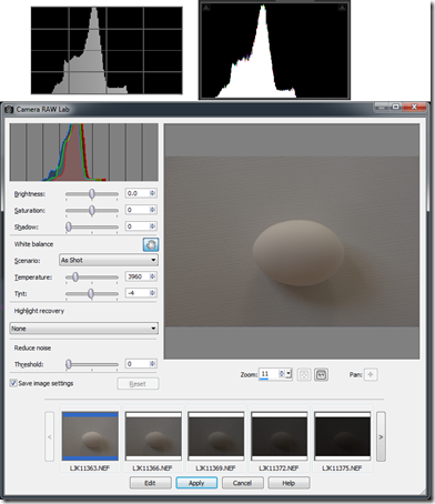 The histogram peak is pretty close to the middle, there is a little “porch” on the right, these are the lighter pixels where the egg has more light, and another at the left corresponding to the darker shadows, especially in the cloth. Note that the data in the histogram does not go all the way to the left, black, end, nor the right, white, end. There is nothing in the photo that is nearly black, and nothing that is nearly white.
So far I have talked about the histogram in very general terms and not given any specific details on using the histogram. There is a reason for that. Let’s go back to that 18-percent gray egg and the barn. If it is 18 percent why is the data in the middle, isn’t that 50 percent?
A little detour
Here we need to take a little detour and look at the “output” end – you are seeing this on a monitor. Most photos are seen on monitors or screens of phones, tablets, and such. When picture data is sent to a monitor the pixel brightness on the monitor does not correspond linearly to the pixel data values. For example a patch of pixels with a data value of 200 is not twice as bright as a patch with pixel values of 100. The brighter patch is actually about 4.6 times as bright. Huh? The brightness, or rather the data is expanded “exponentially”. The mathematical relationship is a power function, the conventional exponent, called gamma, is 2.2. Let’s not go into the details or the reasons, just accept that this is how it is done. If you are in the monitor business, you pretty much have to follow this convention if photos are supposed to look realistic and match what you see on other products. Similarly if you are in the picture file business you better compress your data in the equivalent manner if it is to look good on monitors. You can get a lot of information and misinformation on this if you search for “gamma correction”.
The data values shown in the histogram do not relate directly to the brightness values of the scene that was photographed. The values correspond to the compressed data. Even the histogram on the camera shows this compressed data, as does a histogram displaying “raw” camera data. With this compression the 18-percent gray value comes out just below the center of the range.
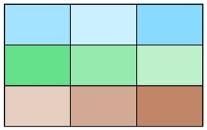
In the chart below the 18-percent, “normal”, exposure is indicated by the large triangle with “0” in it. The values to the right and left show where the data would end up if the camera data were compressed in exact complement to the monitor expansion. You can see what one or two stops overexposure would get, and similarly one to several stops underexposure. Actual photo data produced by your camera or processing tools does not follow this exactly, there are several different conventions for “color space” that include variations from this relationship particularly at the bottom and top ends.
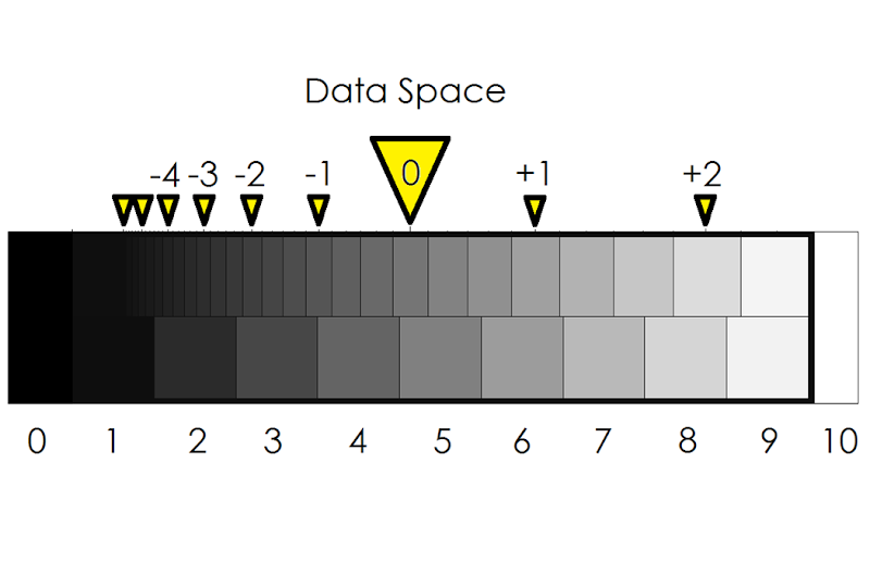
If you are still with me, you will now realize that the histogram can be a very useful tool but it is a bit hard to relate to camera exposure. Looking at the chart above you might conclude that there is a bit more than two stops “head” space on the white side. If you over-expose the proverbial gray card by more than about two and a half stops the image will be hopelessly full white. Is that so? It is close. Take a look at four photos of my “18-percent gray egg” – one, two, three and four stops over the normal exposure:
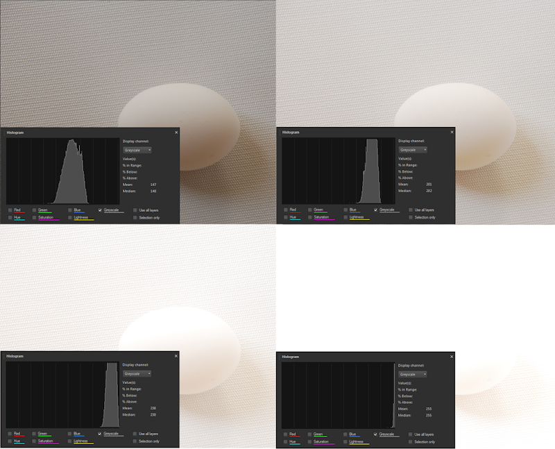
These photos were taken at f/11 with shutter speeds of 1/8, 1/4, 1/2, and 1 sec respectively. As you can see, the three- stops-over (lower left) image fits into the histogram, but just barely. The picture is much too light, even for a white egg on a white fabric. The four-stops-over image is hopelessly overexposed with most of the data off-scale and rendered as a value of 255 – totally white.
How should you expose a white object? If the camera is allowed to make its judgment it will make the object 18-percent gray. A white sheet of paper has a reflectivity of 90 to 95 percent. So the exposure should be 5 times as much (90/18=5), maybe a tad more, that is 2 and 1/2 stops. If the camera said the exposure time should be 1/15 sec then you should select a shutter speed of 1/3 sec. If the histogram is more spread out, you want an exposure that does not cause parts to go “off-scale” and become totally white.
How about the other direction? What does underexposure do? Let’s take a look at the exposures going the other direction.
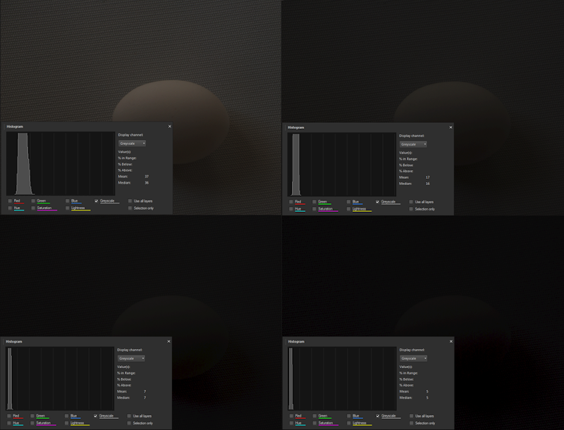
With my camera the exposures “dive” much more rapidly than would be expected from the data space chart above. These exposures are at f/11 and 1/30, 1/60, 1/125, and 1/250 sec respectively. Hopeless after just a couple of stops. As you can see, the photos are totally underexposed but the histogram still shows data above full black, not by much, mind you, but there is still something there. We will come back to that later.
The histogram in post-processing
Here I call “post-processing” anything that is done to the picture data once it is transferred to the computer. Many cameras provide tools for doing processing on the photo while still in the camera. It is pretty hard to do much with the small screen in back of the camera, so I don’t use these features. Let’s start with that photo of the geese that we saw at the top of this article. Here is the photo as seen in Photo Gallery and in PaintShop Pro, using two different tools.
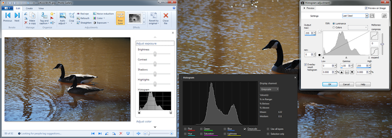
Note that the Photo Gallery histogram is quite identical to what was seen in the camera. I am using the Nikon codec in my computer, so this is not surprising. The two histograms in PaintShop Pro differ quite a bit as they use different tools. Don’t let that bother you, some people see the world through rose-colored glasses and others don’t. Different tools use different approaches. Still, the main features of the histograms are pretty much the same.
Notice the little symbols below the histogram in the Photo Gallery view and in the light window in PSP. In PSP they are labeled “Low” and “High”. These really are controls, sliders, if you will, and they are your most powerful tools for using the histogram in post-processing. These controls let you “spread” the histogram. They define the lowest data value that should be recomputed to black, and the highest data value that should be recomputed to white. The rest of the data is spread proportionately between these values.
Setting the histogram so that there is some data at or near black, and some data just below white will expand the range of tones of the photo. Let’s see what that does for our geese.
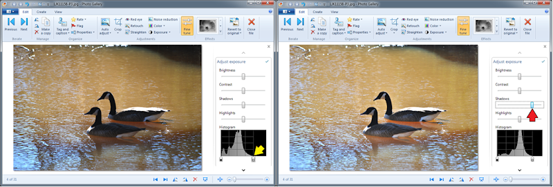
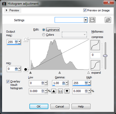 In the left image above the “High” or “White” slider (yellow arrow) was moved over to the left so it is just above the highest data point. The photo was significantly made lighter. The other controls in the “Adjust exposure” panel also affect the histogram, but they adjust the data selectively. The “Shadows” slider, red arrow, affects the lower part of the histogram more than the rest. It translates the lower values to a higher level making the shadows appear to lighten up. Note how we now have an almost good photo of the geese.
Some tools let you manipulate the histogram in many more ways. Take a closer look at the tool in PaintShop Pro. Other tools like Photoshop have similar tools. There are controls for adjusting the “gamma”, yes, that is what we talked about above, and compressing or expanding the mid tones. With the “Curves” tool (not shown) you can take that diagonal line at any point and distort the way the data is manipulated.
Specialized Tools
There are also specialized post-processing tools available with many of the histogram adjustments preset to achieve a number of different effects. For photographers specializing in black and white photography the “goto” tool is NIK Silver Efex. Here are a couple of examples from that tool using this same photo.

On the left the “High key” effect was selected, on the right the “Low Key” effect. Note the histograms and how the data was “shoved” toward the high and low ends of the histogram. There is much more these tools can do, but that is beyond the scope of this article.
The zone system
In a couple of the illustrations above there were some embedded “teasers”. The data space chart shows patches labeled from 0 to 10. The histograms with the egg photos show nine divisions. Here another view from Silver Efex that shows a zone scale underneath the histogram:
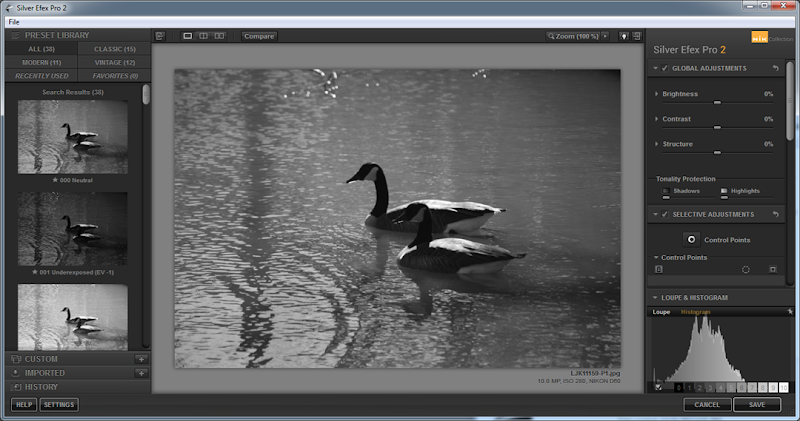
The zone system divides the histogram into 9 “zones” – plus zone 0 – all black, data value 0 - and zone 10 - all white, data value 255. We will leave the details to another article.
For now just one more demonstration as another teaser: Take the two stop underexposed egg photo and spread the histogram out completely and here is what you get:
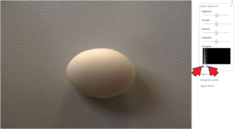
The black slider was moved up a little to meet the data and the white slider was moved down to the top of the data. The earlier image of this photo showed the egg as recognizable but otherwise totally dark. Is it not impressive how much useable picture information there was “hiding in the shadows”? There is much to be recovered from the dark shadows in your photos too!
As a nod of thanks to my unpaid “talent” that so dutifully served in the illustrations for this article here some “studio publicity” shots.
For the geese a NIK Silver Effex creation using the Film Noir 2 effect, this spreads the data so most of it is pushed up against the black or white ends with very little left in the middle. The effect is almost complete black or white.
And for my patient egg a “dolled up” color shot in a more pleasant setting.
.:.
Friday, January 17, 2014
Dust bunnies, dirty lenses and stuck pixels
Modern cameras are absolute marvels at what they can do and how well they do it. Even with much abuse they produce pictures that are almost flawless. There are limits and little problems that will reveal themselves on close examination. This article explores some of those.
Dust Bunnies – the bane of interchangeable lens cameras
If you can remove the lens from your camera, it is almost certain that a little bit of dust will sneak in before you can cap it or install another lens. Such a speck of dust can settle on the sides, the mirror in a DSLR, or on the image sensor. Well, not exactly the sensor, that has usually some optical items stacked on it. If a speck settles on the filter in front of the sensor it will imped the light falling on a small number of the imaging pixels. You can see such specks in photos as “dust bunnies”. Before I go on, let me show you an example, a fairly drastic one I might add:
 There are many “dust bunnies” in the photo above, some of them are indicated by arrows. Here is a close-up view of the one indicated with a yellow arrow (top center) in the photo. The close-up shows the speck as photographed at f/36 while the photo above was taken at f/20.
The smaller the aperture, larger the f-number, the more noticeable will be the dust on the sensor. In fact at wide apertures and even mid-range (f/8 to f/11) the beam of light reaching any pixel is wide enough that a little bit of dust wont show. So it is a problem only when shooting at small apertures, for example in landscape photography when you want everything sharp from the foreground to the far mountains, when you want a really wide depth of field and thus choose a small aperture like f/22.
So, what can be done?
Obviously you will want to keep your camera as clean as possible. Always point the camera opening down when removing the lens – better to let dirt fall out than in.
Your camera most likely has a couple of tools for fighting dust bunnies. Most cameras have a dust-off feature. A bit of ultrasonic vibration is applied to the filter to shake any dust loose and have it, hopefully, fall to the bottom. There might be a surface there designed to be sticky to dust so it gets trapped. The camera can usually be set to perform this function regularly when you turn it on or off. This is like a dog shaking itself dry, but not nearly as vigorous, and hence not nearly as effective.
The second tool in your camera admits that some dirt may remain firmly stuck to the sensor. It lets you take a “dust reference photo”. Nikon calls it “dust off ref photo”. Check you camera manual to see how to record such a frame. The idea is to use this reference photo and subtract the spots in processing in your computer. Again Nikon has such a tool built into its Capture NX software (extra cost item), other manufacturers provide similar tools.
You can clean your camera sensor. That is a very delicate operation. First you need a clean room to do this in, and appropriate tools. Just like having a scalpel does not make you a brain surgeon, having a sensor cleaning kit does not impart the proper skills for operating on your camera. This task is best left to professionals. Your friendly camera store likely offers this service along with other camera maintenance services. A cleaned camera sensor will stay clean until you remove the lens – which like would be the very next day. So I have this service performed only when I want something else done to the camera.
Lastly there is the practical approach. Accept the fact that the world is not perfect. Inspect your photos – especially those that you will proudly show off to friends and strangers – and use the retouch tool, or healing brush, in your post-processing software to edit out any spots.
Dirt on the lens
The front element of your camera lens is exposed to the environment and dirt, even fingerprints, can easily get on it. With interchangeable lenses the back element can 
The photo here shows a candle with a number of very much out-of-focus lights in the background. Some of these light patches are very sharply defined and you can see spots in them. Those little black spots come from dirt on the lens. You would definitely notice dirt of that size by looking at your lens. I am confident that you would take your lens cleaning brush and dust it off.
So what is this rare circumstance when dirt will show and why does it not show for all the out-of-focus light patches in this photo?
Dirt on the lens will show when the bundle of light coming from the lens is intercepted so it will be imaged as a large circle and when that light comes from a very small source, In the case of the photo here, some of the lights were pin-point small lights – LEDs. The patches not showing the dirt were made by larger lights. Essentially point sources are required to show up this problem.
What can you do? Clean your lens. Be very careful doing that, your lens has thin layers of anti-reflection coatings. You do not want to scratch those. Follow the instructions in your manual.
If you are bothered by the fact that some of the bokeh patches, that’s what they are called, are not round but rather boat-shaped, hold your question for a discussion of optics. We won’t get into that in this article.
Stuck pixels
Your camera sensor has millions of individual light sensors, “pixels”. As with all electronic devices some of those tiny sensors may go bad. Having a few non-functioning pixels is not a serious problem and you may not even notice them. A non-functioning pixel might be stuck off and not provide any signal. That would result in a black spot. A black spot would go unnoticed in almost all photos. It could also be stuck on and produce a full output signal. That would show as a tiny white spot. We are sensitive to spots of light and a stuck on pixel is much more noticeable.

The photo here shows an evening scene with the moon and a star. Well, that star, so nice and sharp in this picture, is a stuck pixel rearing its little head.
Let’s take a closer look at that “star”. 
You can see that at least an area of nine pixels is affected. In the actual file data an even larger number can be identified as different from the surrounding area.
Stuck pixels are permanent defects that may be affected by various environmental conditions including sensor temperature. They will tend to be more noticeable in long exposure photos because for those the sensor is operating for a longer period of time and getting warmer is it does its job.
Here again a reference exposure can be used to eliminate the artifacts in post-processing. If you are into astronomical photography you will definitely want to do that.
For the rest of us a stuck pixel will go unnoticed in most photos. If it shows up in a contrasting area, it can be easily touched up in post-processing. There are not likely to be many of those in your camera.
Well, I hope you have gained some useful information from my story on dust bunnies, lens dirt, and stuck pixels. Now I have to go and see if I can get my dirtied-up camera clean again. Ah, the things we do for our readers!
.:.
Friday, November 1, 2013
Composition Rules
Oh, great Master, how do I attain mastery of my craft?
Follow the rules!
The rules of composition
Since time immemorial some artistic creations have been held in higher esteem than others. Some artists are recognized as masters and aspiring newcomers try to emulate their techniques and figure out the “secrets”. Over time a body of techniques, tricks, and practices has been codified into “rules”. A subset of these applies to the arrangement of elements in visual creations, including paintings and photography.
Some of these rules are based on human perception, the way we see and experience the world. Human eyesight keenly discriminates colors and contrast and our minds form shapes and depth from small clues. There was a time when seeing the saber-toothed lion before he spotted you meant living another day. As early artists mentored their apprentices some conventions were passed along and became part of the body of rules.
Modern artists are taught to practice the rules – see admonition above – and they are widely followed. Lay observers are used to seeing the artistic works and the conventions have become a language for visual communication. We perceive some creations as wrong, uncomfortable, they deviate from what we are used to, they feel “flawed”.
The painter and photographer tries to tell a story, convey a feeling, with just a two-dimensional, static, visual image. It is hard to invoke in the viewer the experience that the artist might have had when seeing what she imaged. There is no way to present the biting chill of a winter gale, the fragrance of a field of flowers, the sizzle of a steak, the softness a comforting blanket,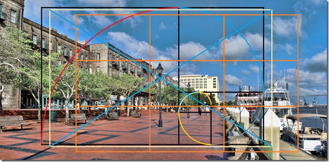 the laughter of a child, the rhythm of a drum, and yet we manage to arouse those feelings with well-crafted images. Having a set of rules, a language that is understood by the viewer, helps us to connect to the subconscious mind; so these rules are important because they work, because they are expected.
So what are these rules for photographers? When you search the Internet for “composition rules” you will get millions of results. There are the “8 top rules...”, the “ten best rules…”, “four easy rules …”, “12 important rules…” and so it goes. For this article I have compiled a larger number of rules. Some are well known, others not always included in a list of “master rules”. The order may not agree with other authors and indeed the “most important” rule is not at the start of my list.
All these widely differing lists of rules should alert your sense of caution. We will come back to that matter after the presentation of the rules.
Make it Golden

The Golden mean even has a Greek letter by which it is known, phi, φ or Φ. It may not be quite as famous, and likely not quite as useful, as for example pi, π. 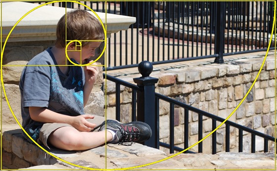
Here is the definition: Two entities, or quantities, are related by the golden ratio if the larger is to the smaller as the sum is to the larger. Expressed as an equation it looks like this:
A / B = (A+B) / A
We can do a little bit of mathematical manipulation, and substitute Φ for A/B:
A / B = A / A + B / A Φ = 1 + 1 / Φ
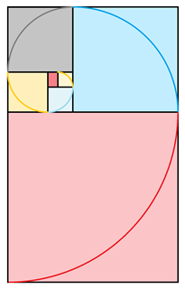
This makes it mathematically rather interesting. The golden ration cannot be expressed as a simple number and, like pi, goes on infinitely when written in decimal notation. The approximate value is 1.618. The rectangles here have that ratio. Note that when a square is sectioned off from such a rectangle the remaining rectangle will have the same proportion. This can be extended and, with quadrants of a circle drawn in the squares, will result in the “golden spiral”.
This proportion may be used as the aspect ratio of a photo. It is slightly wider that the standard 35mm aspect ratio (3x2 or 1.5), but narrower than the modern HD television ratio (16x9 or 1.777...). Positioning the elements of the image according to this value will certainly gain the applause of mathematicians and art historians. It might even “look good”.
Let the thirds rule
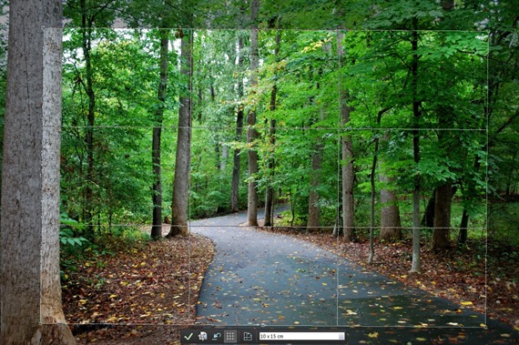 The “rule of thirds” is the most widely acclaimed rule in composition. Just about every list starts with this rule. It is so pervasive that many camera viewfinders, and just about all cropping tools, show the field divided into thirds.
The rule is taught because the human eye is said to be more interested in images that are divided into thirds. Or is it the human mind? This may, or more likely may not, be a natural phenomenon. We all have become conditioned to following this rule because it has been done for centuries. 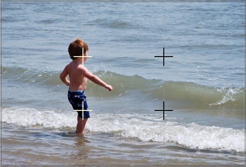
So maybe the reason you should follow this rule it is that your viewers already expect it, because every photographer worth his or her salt uses it in every image.
And what does the rule ask you to do?
Place the important elements at the intersections, the four points around the center. See the illustration of the boy in the sea, the intersection points are indicated with crosses, the “third” lines are very lightly ruled in this photo.
If you have just one object the choice of location is yours but follow the other rules. If there is a horizon, it is best along the lower or upper line. If you have strong vertical elements they should be located along the left or right vertical line. If you can divide your image into thirds you will make all the dilettante judges happy.

Avoid the middle
By their very nature photographs are static images. When the main subject in a photo is dead center the image feels even more static. It seems dull and lifeless. This does not have to be.
Many other rules suggest where to place your elements to achieve a more dynamic, interesting photo. Sometimes just leaving a little more space to one side or another can bring the photo to life. So be careful and stay away from the middle!
Keep it on the diagonal
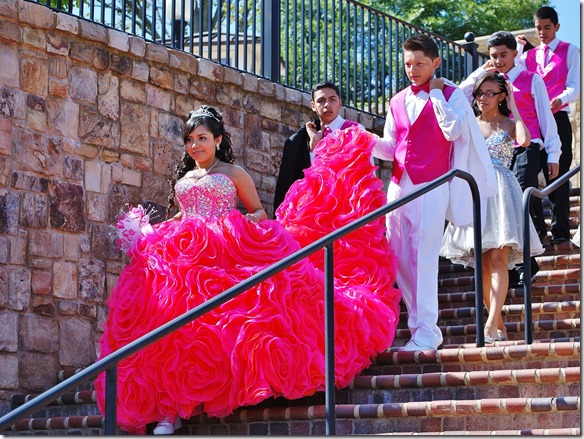 Placing your elements horizontally or vertically can be just as boring as centering them in the middle. Find a way to place your subjects along a diagonal or at a dynamic angle to bring “action” to the picture.
Let odds rule
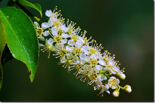
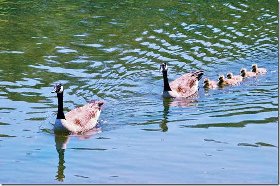
Now this rule may strike you as odd. The rule says that if you have multiple elements having an odd number of them is more “pleasing” than an even number. Our human mind automatically organizes what we see, so we unconsciously pair up the elements. Supposedly we are more pleased when one prime subject is accompanied with two secondary elements. Elements arranged in triangles are more dynamic and interesting than items in square or rectangular placements.
This rule probably breaks down if there is a multitude. After about four or five items we see “many” unless we consciously count. Please don’t go off killing the chicks just to comply with this rule!
 Simplify
Eliminate everything that does not support your message!
Like this rule, if it can be said in just one word, that’s the way to say it. The same applies to pictures. If you have just one subject you can make a more powerful statement about it than if you must spread the viewers’ attention over a number of elements.
Present your subject simply. Anything else is a distraction. That applies to items in the background, it concerns lighting and details.
Define your center of interest. Review everything else, including space and format. See how you can eliminate or deemphasize everything that does not conform to your intended message.
Be careful with this rule! As Einstein is quoted as saying “make everything as simple as possible, but not simpler!” It is possible to overdo. As you review the scene ask yourself what is there that does not enhance the subject but also what is there that strengthens the visual message.
This rule can be used in editing as well. Anything in the frame that doesn't support the scene takes away from it.
Fill the frame
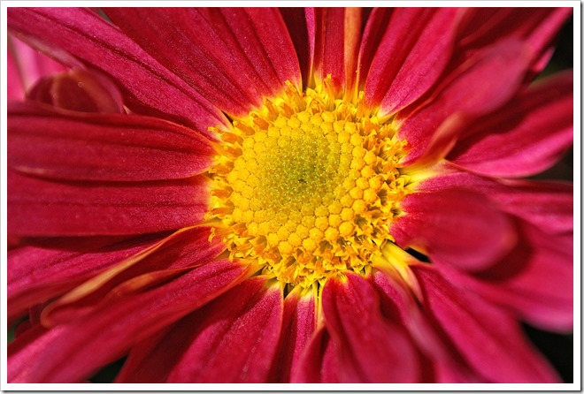 This seems like a simple rule. But is it? Think about it and you will ask, “what frame?”, “fill with what?”
The “frame” is not your camera’s sensor or viewfinder. Think of how you will present it to your viewers. Will you show it as pictures in an album? Will the image be presented as a large print on a wall? Most likely these days, your viewers will see your art on a monitor. Older monitors have a 4 to 3 aspect ratio (1.33..) while the newer ones use the HDTV format of 16:9 (1.777..). Keep in mind that the 35mm format is 3:2 (1.5). “Fill the frame” is not quite as easy as it seems. Many photographers like to be able to crop to the final format - even the golden ratio! – and leave some space for that when taking the picture.
The second part of the question is what to fill the frame with. That does not mean the main subject! It means your final picture with all that is needed for the image that you wish to convey. Another rule calls for “breathing space”. That space is part of the picture, so there really is no conflict. The rule to “fill the frame” does imply that you need to get close enough to capture the image you wish to present. Leave no extra, wasted space.
Cut with caution
In many instances you will not want to show the entire subject in the photograph the entire subject. A portrait is a ready example. It will be necessary for you to decide what to include in the photograph and what to exclude.
This rule, to cut with caution, wants you to think carefully. 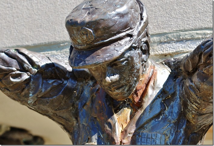 Some parts of a subject can be cut without the viewer missing it. Some portions can be readily imagined, almost automatically so, and allow you to concentrate on the important details.
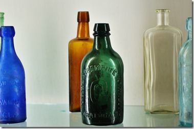
When you first saw the photo of the bottles or the statue on this page, did you really miss the parts that have been cut? Does it matter that some elements are outside the frame, implied and not included. You can cut powerfully and tell the story you wish to convey. Include all that is needed and exclude the rest.
Frame the subject
With any photo you wish to tell a complete story. Including elements inside the image that help frame the primary subject can add a sense of completeness to the picture. The viewer’s eye will be directed to the main area.
Framing elements, like the tree and the rocks in the photos below, provide isolation of the main subjects without tearing them from their environments. Use natural and surrounding elements to highlight your subject.

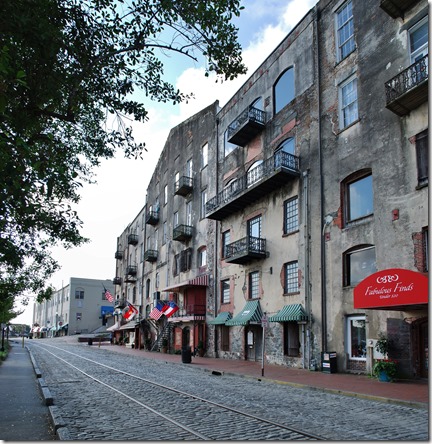
There is another consideration when it comes to framing your photo, and that is the actual presentation frame. Not every photo fits perfectly into the “golden ratio-ed” frame. Make the frame fit the subject.
Balance the elements
Photos can appear empty, void of something. Well, they can be unbalanced. That detracts and even disturbs the viewer. The elements of a photo should be balanced to present a harmonious whole.
Place your elements in such a way that the secondary item supports rather than competes with the main subject. Find a direction of view that includes the elements in such a way that they balance each other.
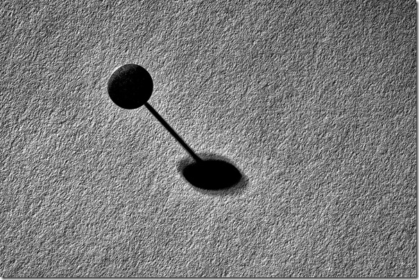
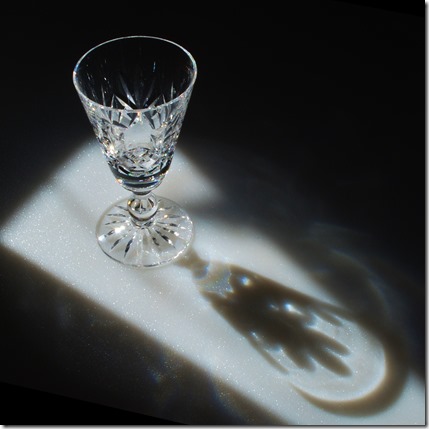
There are two examples here that attempt to illustrate balancing elements. With the photo of the glass its shadow acts as a balancing element.
The photo of the moat uses a small dark area on the right to balance the large light area on the left. It also does that with a similarity in shape.
 Lead to your subject
Leading lines in your photo are the most powerful way to direct how the viewer experiences the picture. Our attention is naturally drawn to follow lines. These can be actual lines of parts of the image or lines formed by a series of objects.
Our mind is programmed to “connect the dots”. You can take advantage of that and literally lead your viewer on a journey of your photo, showing the parts of your image in the order that you decide.
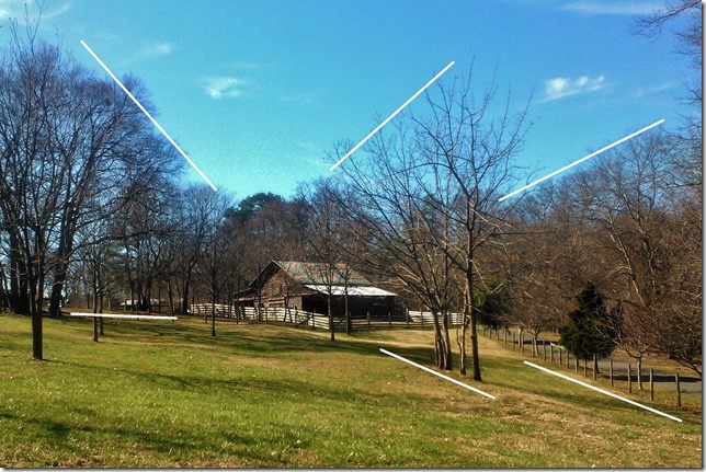
There are many kinds of lines. They can be straight, curved, simple or complicated. They can even be formed by the tops of trees against the sky, as implied in the photo here.
As you use leading lines, be sure to lead to an element you wish the viewer to visit. Don’t lead out of the frame unless you want the visitor to depart!
Help your viewer know where to look. Find elements in your scene or subject that will form leading lines and use them as guides within your photo.
Provide breathing space
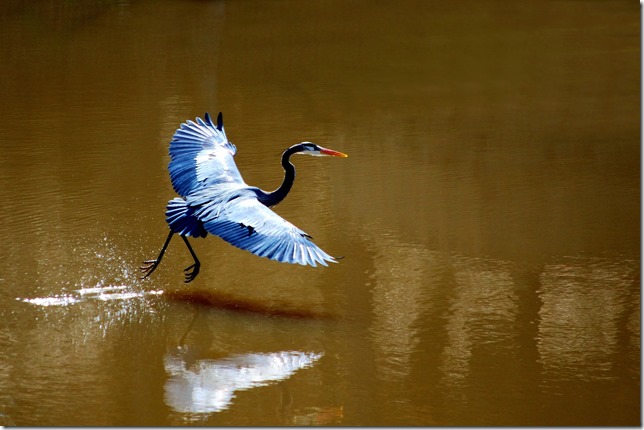
Another form of space is called “negative space”. The photo here has plenty of negative space. Such use of space can be very powerful. Negative space can even be stark white or black and be a powerful component of an image.
If a subject is meant to be in motion, space in front of it will give it someplace to go. It helps the viewer to imagine the motion.
Even static subjects, portraits for instance, should allow space in front. Subjects should look “into” the photo. If your subject is looking out of the frame, the viewer’s attention will be pulled out as well. Don’t lose your audience before they see your creation!
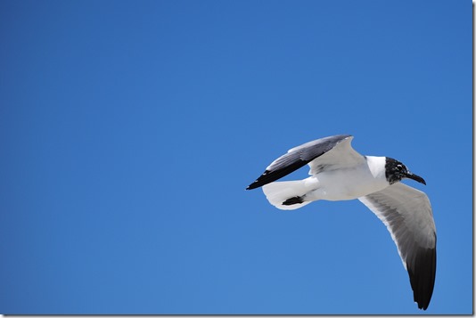
The two images of the sea gull, both cropped from the same photo, and at the same scale, give quite different feelings of the subject.

Clean the background
The background in a photo can be quite distracting, but it can also support your message. It is natural to concentrate on your subject and not pay attention to what is behind it.
As you prepare to take the picture, look carefully. Does the background help tell the story or is it saying something quite different?
Sometimes just a small shift sideways or up and down will place a more complementary background behind your subject.
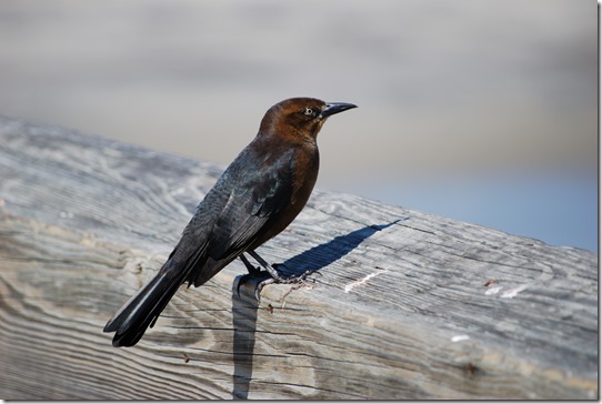
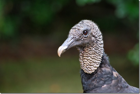
You may also be able to tone down a busy, distracting background by using a shallow depth of field with a wide aperture setting.
Be careful when using an SLR camera which presents the scene in the viewfinder as produced by the camera lens. To aid focusing, the lens will be operating at maximum aperture. That is also the setting for the shallowest depth of field and the background will be blurred. Your exposure setting, however, may call for the lens to be stopped down when the actual photo is captured. The background may turn out in disturbingly good detail.
Say it with shapes

Show it in patterns
Patterns and textures are tools for interesting and exiting photographs. They are all around us; some are interesting and compelling by themselves. The rhythm of repetitive elements, be they dancers or strands of rope, can bring harmony and a sense of order to your photos.
Taking patterns even further results in textures. By themselves textures can make very interesting photos. As an element supporting other subjects texture can add, well, texture to a picture.
Say it with lines
Lines are something our eyes are most sensitive to. We notice them, we follow them, we translate them into shapes. We see them as the edges of objects, in the arrangements of elements. Look and you will see lines everywhere.
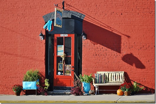
Use lines as leading lines and use them as elements of your pictures. The illustrations here are dominated by shadow lines and the lines formed by the objects themselves.
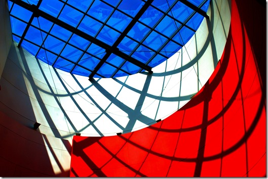
Allow symmetry to speak
You would think that the rules stated so far seem to discourage symmetry in photographs. Don’t accept that! When you encounter a scene with glorious symmetry, maybe a formal garden, a stained glass window, or just a perfect tree on a hill, use it! It may be someone else’s creation or a natural formation, but it is there for you to use and show. Symmetry provides a formal, calm, ordered feeling, even when it is not completely perfect.
Pick your view
You don’t have to just look straight ahead. There are things to see looking up and looking down, interesting objects behind and inside others. Some objects appear surprisingly different when viewed from other than a normal angle.
An unusual angle may provide an easier way to place the elements into a pleasing composition.
The appearance of objects and the mood of a picture can change dramatically with the angle of view. Looking down makes objects appear smaller.
Experiment with point of view, your photos will be richer for it!

 Use depth clues
By their very nature, photographs are two-dimensional. What you photograph most likely is very three-dimensional. Use the depth clues in the converging perspective lines, in the different shades of haze of distant hills, the different amount of blur in close-up scenes.
You can make a photo give the feeling of space by having items in the foreground.
Look for and use depth clues, position them to aid the overall composition.
Emphasize your subject
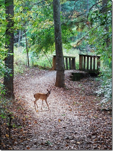 It stands to reason that you want your primary subject to be visually the center of attention. Sometimes subtle elements can distract the emphasis to irrelevant items.
Try to put your subject into the “best” light. The viewer’s eye is attracted to the lightest area of your photo. In a mostly light image the point of greatest interest may be the darkest object.
Use leading lines and lighting to guide the viewer through your photo. 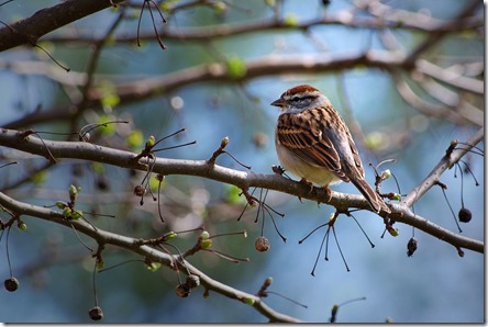
Sometimes your main interest cannot be either the lightest or darkest element. See if you can position it against a background element to provide the best contrast. Maybe just a small hole in the canopy of trees can provide a bit of clear sky as the background for your bird friend. Shift your position to take advantage of that.
Be very conscious of emphasizing your subject.
Say it with color
Just as you select the subject of your photo, also be mindful of color. Color can be just as much a topic as shape or texture. Colors can create the right mood. Think of the somber cold tones of a rainy day or the bright warm colors of a sunny afternoon. Strong coloring can set the tone, so can singling out elements with strong colors to bring your image to life.
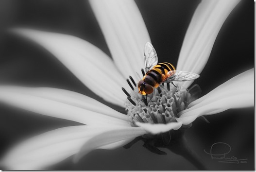
Photographers specializing in monochrome have an additional advantage here. The monochrome image is much more of an abstraction than a color photo. Giving the monochrome rendering just the right tone can be a powerful way to support your message. Selective coloring can emphasize just the element you want to present. Use color to your advantage.
Conclusion
Oh, great Master, how do I attain supremacy in my craft?
Break the rules!
Imagine yourself looking at the latest photos posted on your favorite sharing site. You scan past the overly gaudy landscapes, the wide-eyed kittens, the beached boats under doomsday clouds, and on and on. What photo attracts your attention, stops your finger rolling on the scanning wheel? It has to be extraordinary, unusual, unexpected, surprising, astonishing.
When you follow the rules to create your image, your photo will conform to an expected, familiar visual language. The message will go right through, right to the subconscious. The viewer isn’t stopped by “grammar” or “misused words”. The viewer understands your message. It is like a sugar-coated pill. For the most part, that is exactly what you expected, what you wanted. You let your image speak, to transmit the message, the feeling, the mood. Sometimes staying within the rules may keep your photo from being extraordinary, it may come up to the highest standard, but it might not stand out.
If you want to be noticed, admired, you need to surprise, enchant, you need to break out from the crowd. You need to break the rules!
Why all those pages of rules only to be told to ignore them? Ignoring them is not the secret. You must know when to use and when to break them. Know what the viewer expects, then deliver what you want her to experience. Surprise, jar, shock, astonish, amaze, know what feeling, what mood, you want to arouse. Knowing the rules and why they work will help you to understand how you can compose and deliver that image that stops the viewer in his tracks to pay attention to what you have to show.
One final rule, no, not rule, just a suggestion for all of your picture taking: Use a tripod with your camera as often as you can. It will transform your thinking into that of a photographer not just a snap shooter. Taking a photo will take longer, it will give you time to look, to see, to compose. It will help you to wait for that cloud to get into just the right position, it will give you time to see the trees sticking up behind your model, the smudge on the coffee cup. It will make you a better photographer!
.:.


